

Univariate Graphical Analysis: 5 Must-Know Graphs
Part 1: Cheatcode to Exploratory Data Analysis (EDA)

Whenever you get a dataset, the first step is to ask 8 key questions to lay the foundation of understanding data.
If you missed that article, I highly recommend you give it a read: 👇🏻
8 Simple But Important Questions to Always Ask From Your Data

I often hear this question from beginners, “How do I explore data?”
And while you’re at it, Subscribe, as my goal is to simplify Data Science for you. 👇🏻
What is Univariate Analysis?
Simply stating, to examining and explorating a single feature or variable or column in a dataset, is called Univariate Analysis.
It involves generating summary statistics, which was covered here.
Today, we’ll focus on 5 essential visualizations (e.g., histograms, box plots), to understand the distribution and characteristics of that specific variable.
Before starting the visualization, let’s import the required libraries.
import seaborn as sns
import matplotlib.pyplot as plt
%matplotlib inline
Let's dive!
1. Categorical Data
1.1. Nominal: Nominal variables are categorical variables that represent unordered categories or groups. There is no inherent order or ranking among the categories.
Examples: Gender (male, female, other), race (White, Black, Asian, Hispanic), and eye color (blue, brown, green).
So, for nominal data you can use:
a. Countplot
-- Purpose: Count occurrences of each category in a categorical variable.
-- Usage: sns.countplot(x='category_column', data=data)
# Using a countplot to understand the "Category"

plt.figure(figsize=(10, 6))
sns.countplot(data=data, x="Category", order=data["Category"].value_counts().index)
plt.xticks(rotation=45)
plt.title("Countplot of Categories")
plt.show()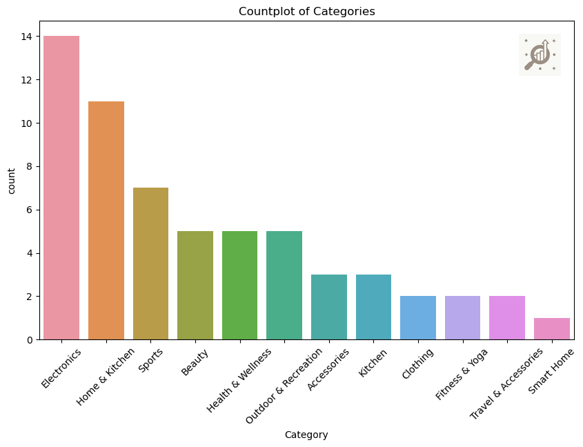
Note: Countplot is used to show the counts of observations in each categorical bin using bars and easily compare the frequency of different categories within a single variable.
Secondly we have,
1.2. Ordinal: Ordinal variables are categorical variables that represent ordered categories or groups. The categories have a natural order or ranking, but the differences between the categories may not be equal.
Examples: Education level (high school, bachelor's degree, master's degree), socioeconomic status (low, middle, high), and customer satisfaction ratings (poor, fair, good, excellent).
So, if you have less than 4, categories then you can visualize them using:
b. Pie Chart
-- Purpose: Display the proportion of each category in a categorical variable.
-- Usage: plt.pie(data['category_column'].value_counts(), labels=data['category_column'].value_counts().index)
# Using a piechart to understand the "CustomerAge"

data["CustomerAge"].value_counts().plot(kind="pie", autopct = "%.2f")
plt.show()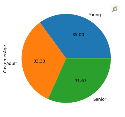
Note: A pie-chart provide a visual representation of how individual categories contribute to the total, to visualize the percentage of the data belonging to each category.
2. Numerical Data
2.1.Continuous: Continuous variables can take on any value within a certain range. They can be measured to any level of precision.
Examples: height, weight, and temperature
2.2. Discrete: Discrete variables can only take on specific values and cannot be measured to any level of precision. They often represent counts or whole numbers.
Examples: The number of children in a family, the number of cars in a parking lot, or the number of pets owned by a household.
a. Histogram
Histograms, a bar plot in which each bar represents the frequency (count) or proportion (count/total count) of cases for a range of values.
-- Purpose: Display distribution of a single numerical variable.
-- Usage: plt.hist(data['column'])
# Using a histplot to understand the "CustomerRating"

plt.hist(data["CustomerRating"])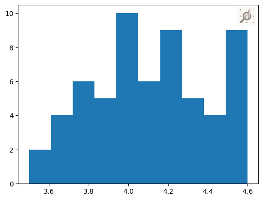
Note: Understand the overall shape of the data distribution, including any skewness, peaks, or gaps in the values and even clusters in data.
b. Distplot
-- Purpose: Visualize distribution of a numerical column.
-- Usage: sns.distplot(data['NumericalColumn'])
# Using a distplot to understand the "ShippingTime"

sns.distplot(data["ShippingTime"])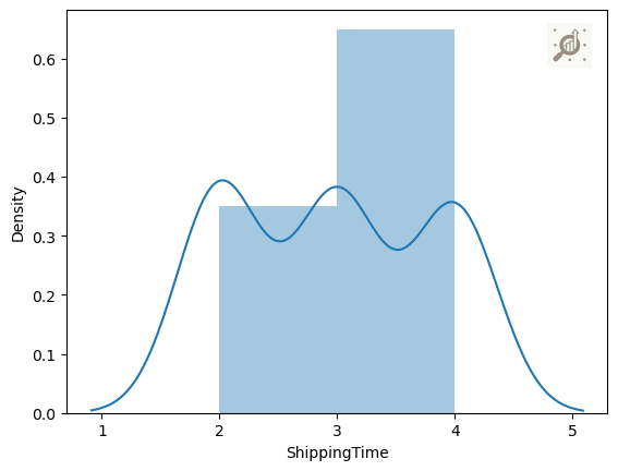
Note: It is beneficial for understanding the shape of the distribution/density, identifying potential outliers, and assessing the overall pattern of numerical data.
c. Box Plot (Box-and-Whisker Plots)
Box plots, which graphically depict the five-number summary of minimum, first quartile, median, third quartile, and maximum.
-- Purpose: Show summary statistics and identify outliers in numerical data.
-- Usage: sns.boxplot(x='column', data=data)
# Using a boxplot to understand the "CustomerRating"

sns.boxplot(data["CustomerRating"])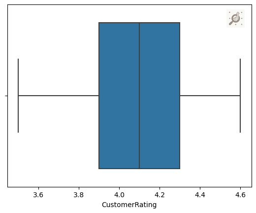
Note: Box plot visualize the distribution and central tendency of numerical data across different categories. To identify variations, outliers, and the overall spread of numerical values within distinct categorical groups.
If you’d like to explore the full implementation, including code and data, then checkout: Github Repository. 👈🏻
Note: The utilized datasets are solely for visualization demonstration, which you can find here. Consequently, I refrain from providing comments on the insights derived from each graph.
If you find this read helpful, stay tuned with ME, so you won’t miss out on future updates.
Until next time, happy learning!